info callout Bold can also be used to add emphasis in body text. See using bold for style.
Typography
Our digital products use two font families.
- Muli/Mulish is used most of the time
- Crimson Text is used as a level one heading style in some products.
Our default (base) font-size is 16px. The rest of our typography scale is based on measurements relative to this default.
Font weight
Font weight is the thickness of text. We use four different weights to differentiate headings from body text and emphasize body text.
We use the following design tokens to specify font-weight:
- Regular:
--regular: 400; - Semibold:
--semibold: 600; - Bold:
--bold: 700; - Extrabold:
--extrabold: 800;
Headings
When formatting headings, use the following sizes and weights:
- H1, Muli 32px, 2rem, Bold
- Alternate H1, Crimson 56px, 3.5rem, Regular
- H2, Muli 28px, 1.75rem Bold
- H3, Muli 24px, 1.5rem, Regular
- H4, Muli 20px, 1.25rem, Regular
- H5, Muli 18px, 1.125rem, may use Regular, Bold, or Bold underlined depending on context, but should be consistent across the product
- H6, Muli 16px, 1rem, Semibold
Code examples below demonstrate how each of these and other typography elements display.
Body text
All body text is 16px or 1rem, regular weight.
Links
Links within body text are teal-400 and underlined by default.
In some cases, links can be neutral-400 and have the underline removed, except on hover. This style is often used when many links are presented together, such as with list items where repeated underlines impede readability. Contact the Design System team with questions about when to use this style.
We also offer a Link reusable design.
Lists
See our style guidelines for formatting lists. All list items should have a margin of 8px on the bottom
Line height
Line height is based on the size of the font itself. Ideal line heights for standard text have a ratio of 1:1.5. For example, a type of 16px would have a line-height of 24px (16 x 1.5).
The exception is headings that are 24px or larger, which have a 1:1.25 ratio.
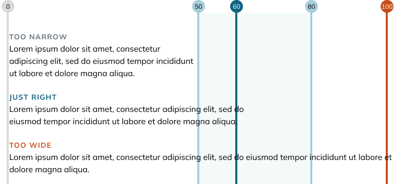
Line length
Line length is the number of characters on a single line, including spaces. Lines that are too long degrade eye tracking from line to line, making it difficult to gauge which line to read next. Lines that are too short make it difficult for a reader to maintain a steady reading rhythm.
While there is no perfect line length, aim for an average of 50-80 characters per line.
You can use the design token --line-length: 60 characters.
Typography code examples
See example pen by U-M Library Design System (@umlibrary-designsystem) on CodePen.